

You must log in or # to comment.
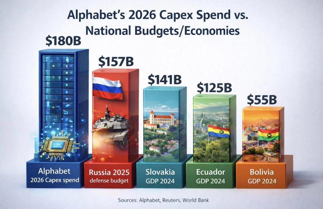
That‘s the not beautiful type of chart… not on scale, unnecessary 3D shapes, bloated with images that don‘t really help understand the data being shown
I think it looks pretty :)
Those bars are wildly not to scale.
Its very sus that “russia defens budget” is here but not “us empire offense budget”
It would be bigger, which would have no surprise value.
Also if you added empire, it would look like propaganda.